redesign review: chobani
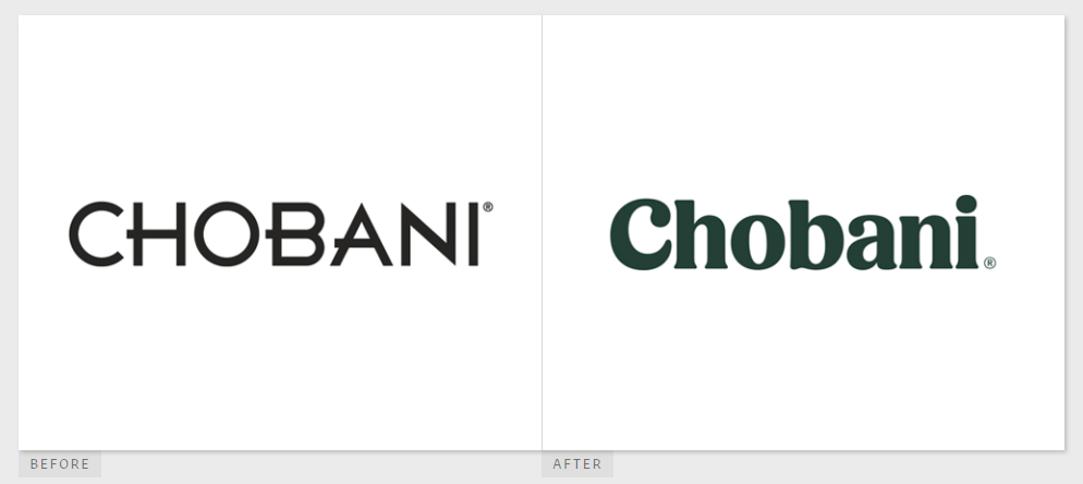
Chobani introduced its new brand and packaging yesterday, done in house. I have to say, I’m a bit disappointed. While I love the color palette of rich, earthy tones (who doesn’t love a nice burnt umber?), the font change is really reminiscent of a cookbook I’d find at my grandmother’s house. I thought the old Chobani font was really unique, with its sharp edges and a cute little overhang on the H and B. The new font feels a bit tired, and not nearly as unique.
The entire brand strategy is very Americana, which feels off to me as I remember watching a 60 Minutes interview with Chobani’s founder, a Turkish immigrant. The piece was about how he hires immigrants and refugees (many from Muslim countries which seem to be up against the most racism these days) and offers them jobs in his rural Idaho factory. From one immigrant to another, he’s big on offering opportunities to people new in this country.
Maybe I’m reading into things a bit much, but I thought the story behind the company and its ethnic diversity were the factor that set it apart; something to really be proud of. So the move to this new brand that feels very 1950s housewife in pearls baking an apple pie – well, it just feels confusing. Execution is good and the brand is thorough, but it doesn’t seem to fit the company’s story. Overall, I’ll give this one a C.