redesign review: taco bell
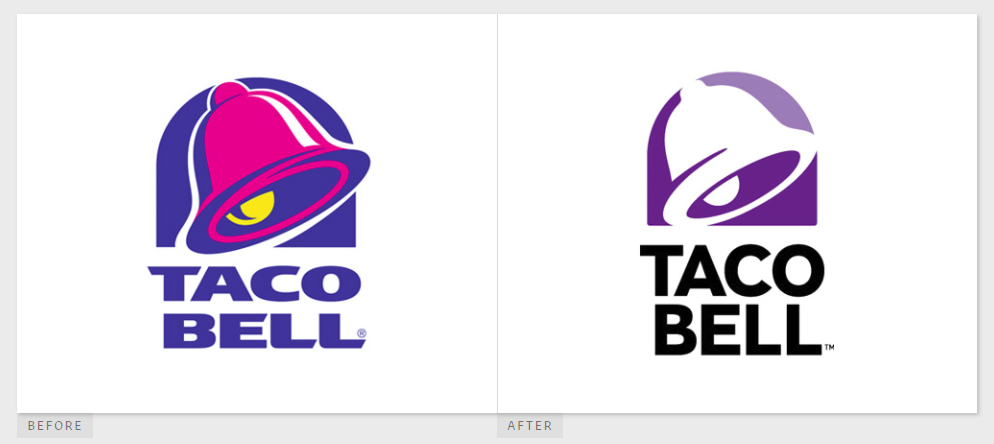
Taco bell released a new logo this week along with a fancy new flagship restaurant (can we call them “restaurants”?) in Las Vegas. I know ragging on Taco Bell’s…er… refined cuisine would probably be the popular thing to do, but let’s be honest – the Crunchwrap Supreme is a masterpiece.
My first reaction to the new logo was disappointment. Sure, the old logo was nothing special, but Taco Bell’s menu (and the fact that they are usually serving up five different radioactive flavors of Mountain Dew at any given time in their soda fountains) really lent itself to something bright and colorful. The flat purple icon, along with a gradient – oh! The horror! – was kind of a, womp womp for me.
But wait! All hope is not lost! Lippincott actually shows the icon’s application on a variety of backgrounds and utilizing different patterns, primarily for mobile. I think this is a really cool way to integrate the logo. Overall, I’d give the logo itself a B-, and the application an A.