redesign review: diet coke
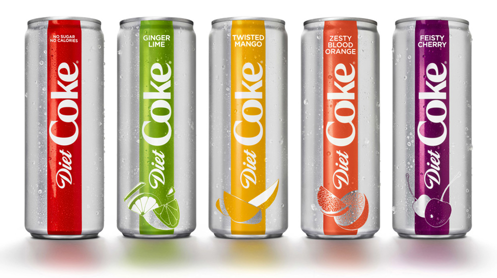
Diet Coke is the first major brand to ring in the new year with a fresh look. The big push for this rebranding was the introduction of four new flavored variations of Diet Coke. Coke has been shoehorning their Freestyle machine in anywhere they can, from movie theaters to fast food chains. While I appreciate the quick access to any flavor your little heart can dream up, I’m more of a traditionalist, and I side eye the leftover drips of fluorescent pink falling into my cup of soda.
In any case, I really like the sleek new cans. The colors look lovely together, though I’m not sure how often you’d actually see this collection of flavors together in the wild.
The real shake up, in my opinion, is the change to the lowercase k in the logo. It’s subtle, and compared to all of the other changes almost unperceivable, but the k formerly had a nice organic swoosh into the e that mimicked the curvy flow of the other three letters. For reasons I don’t understand at all, it was replaced with a sharp geometric k, that to me sticks out like a sore thumb. I give the logo change a D, because it goes against all good design practices, but the rebrand in general gets an A from me. Job well done!
